My vision is slipping. At 40. It happened.
Glasses saved me. Suddenly the world wasn’t just a blur. I didn’t bother with contacts—eye drops are a struggle for me. No desire for laser surgery either.
There’s just one problem.
The shower.
My housekeeper is great. I really like her. She changes my bottles every week. Swaps the shampoo with the body wash. It drives me nuts. I don’t read labels. I just grab what feels right based on memory and muscle twitch. Habit matters.
Hotels break that habit.
The bottles move. Every time.
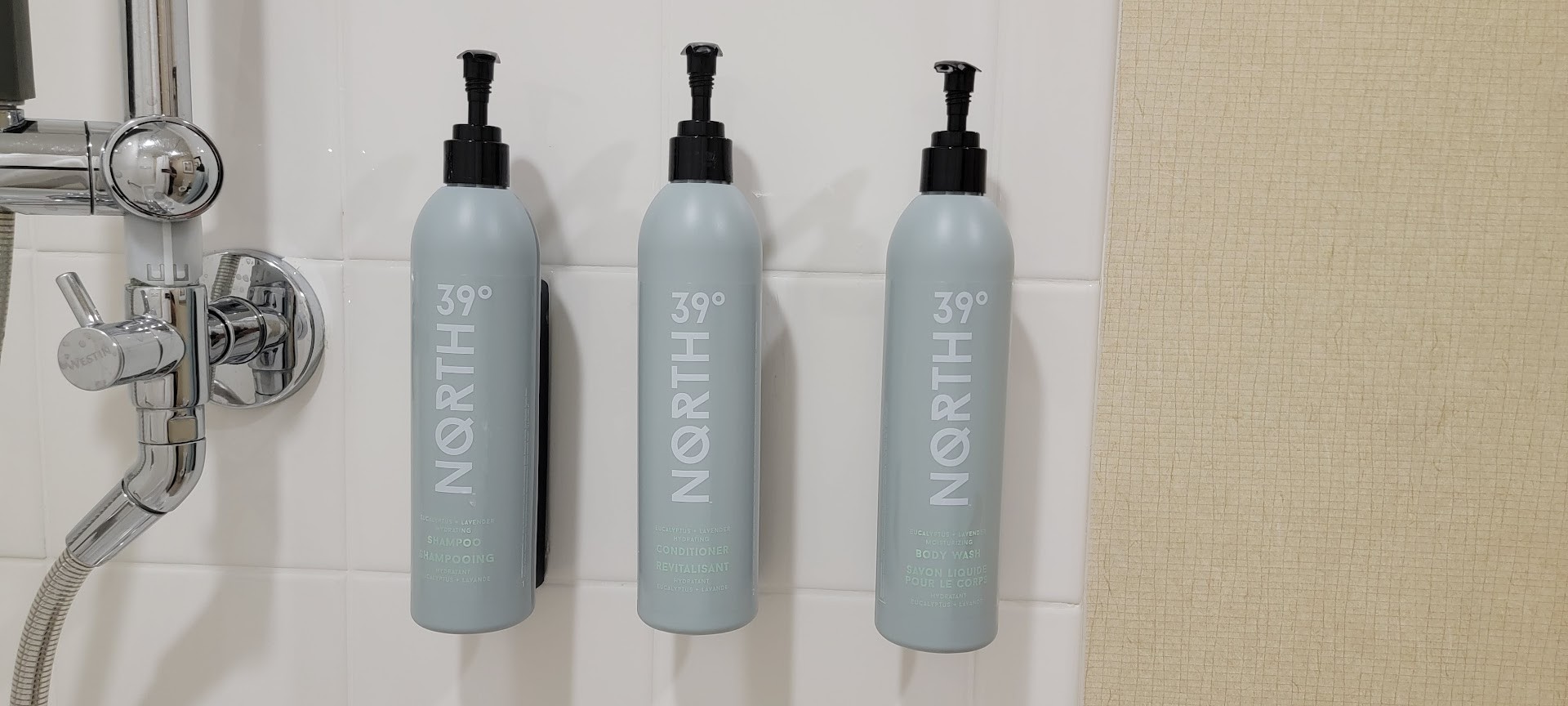
I can’t rely on placement. So I try to read the label. The text is microscopic. It requires vision I simply do not possess under steamy, wet conditions.
Here is my current routine.
I step in. With glasses. I memorize the bottle layout. Step out. Remove glasses. Step back in.
I always forget to remove the glasses before getting wet. Or I leave them on the counter. So I have to get back out. Grab them. Climb in. Get out. Climb back in again.
Why is this so hard?
It wouldn’t take much. Bigger font. Darker ink. A high-contrast background. That’s it.
Hotels buy these toiletries by the pallet. They could specify readable fonts as a brand standard. Basic user experience. Even within single brands, the inconsistency is wild. Some Marriott labels are barely legible scribbles; others, like the ‘white tea’ line, are actually readable.
Paying attention to details often outweighs the budget.
That’s the thing. You have a product. Use it well. Focus on how people actually feel while using it.
Otherwise. You get guests washing their bodies with hair conditioner. Or they turn on the shower. They stand there confused. Which bottle? No idea.
They step out. Cold water drips. They slip. The bathroom floor gets flooded. They’re shivering until they find the right thing and climb back under the heat.
That isn’t a morning ritual. That’s an obstacle course.